Problem
Very cluttered and out-of-date design. People that are target group are coming to learn new skills such as programming, design, 3D or digital marketing, and they are landing on outdated and cluttered design which immediately gives them a reason to doubt the information and the quality of the academies.
Approach
To see what works and what doesn’t, first, I need to put myself in user perspective coming to the webpage. Being aware that there are different types of users I created 3 personas representing the target groups
Visual pain points

Result
Complete UI overhaul for better experience, usability and clear infomation.


Explore More
Explore More
Explore More
Explore More
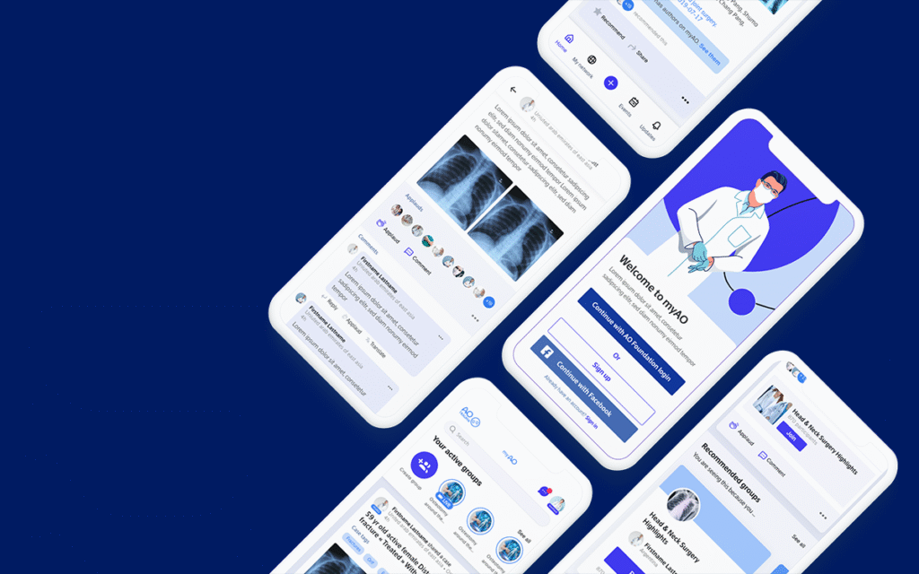
myAO: High-Efficiency Clinical Exchange
myAO: High-Efficiency Clinical Exchange

Spock and Navis